Color
Intro about implementing color within a single theme and with multiple themes. TBD
Implementing the layering model
There are two ways to implement the layering model within a single theme, either by using explicit layer tokens or smart contextual layer tokens. Both ways are acceptable with different pros and cons that should be weighed in deciding which to use when building your product.
| Token type | Definition |
|---|---|
| Layer set tokens | Explicit tokens used to manually map the layering model onto components. They come in sets based on their level in the layering model and are part of the theme package. |
| Contextual layer tokens | “Magic” tokens that automatically infer value based on the context a component inside the layering model. They are part of the component package and don’t have an explicit value assigned to them. |
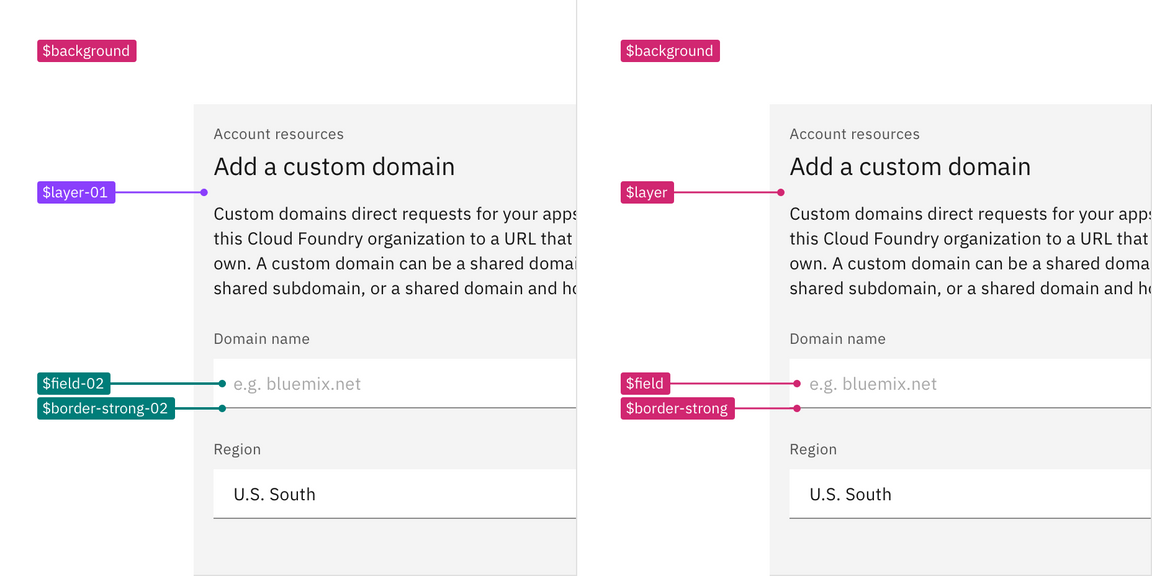
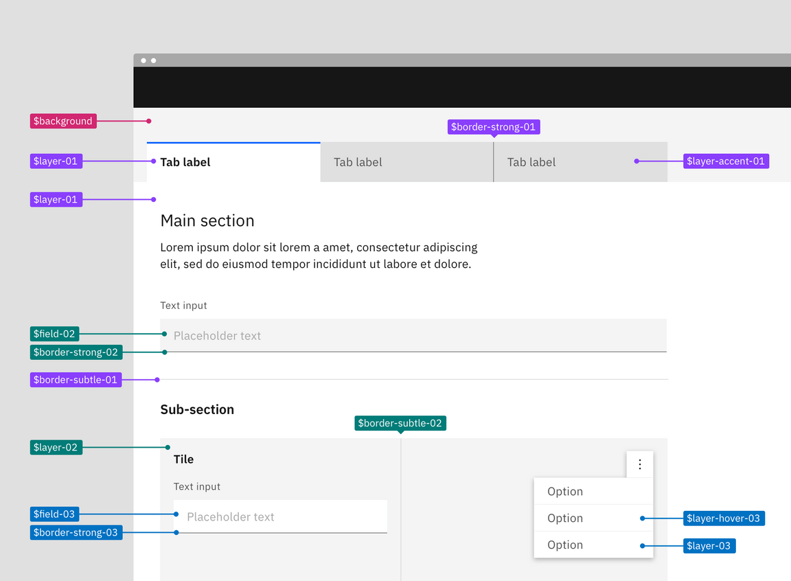
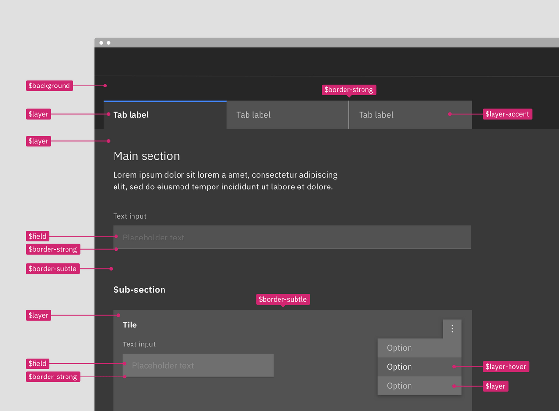
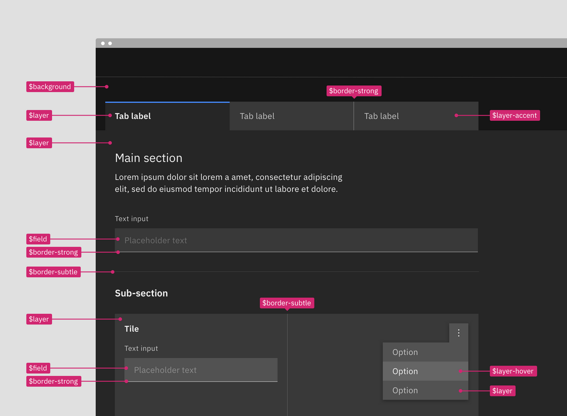
A visual spec using layer set tokens (left) versus contextual tokens (right).
Token list
| Contextual tokens | Layer set 01 | Layer set 02 | Layer set 03 |
|---|---|---|---|
$layer | $layer-01 | $layer-02 | $layer-03 |
$layer-active | $layer-active-01 | $layer-active-02 | $layer-active-03 |
$layer-hover | $layer-hover--01 | $layer-hover-02 | $layer-hover-03 |
$layer-selected | $layer-selected-01 | $layer-selected-02 | $layer-selected-03 |
$layer-selected-hover | $layer-selected-hover-01 | $layer-selected-hover-02 | $layer-selected-hover-03 |
$layer-accent | $layer-acccent-01 | $layer-accent-02 | $layer-accent-03 |
$layer-accent-active | $layer-acccent-active01 | $layer-accent-active-02 | $layer-accent-active-03 |
$layer-accent-hover | $layer-acccent-hover-01 | $layer-accent-hover-02 | $layer-accent-hover-03 |
$field | $field-01 | $field-02 | $field-03 |
$field-hover | $field-hover-01 | $field-hover-02 | $field-hover-03 |
$border-subtle | $border-subtle-01 | $border-subtle-02 | $border-subtle-03 |
$border-subtle-selected | $border-subtle-selected-01 | $border-subtle-selected-02 | $border-subtle-selected-03 |
$border-strong | $border-strong-01 | $border-strong-02 | $border-strong-03 |
Layer set tokens
Layer tokens are sets of explicit tokens used to manually map the layering model onto components. They are part of the theme package and come in predefined sets that pair ui and interaction colors together to accurately match the layering model and enforce correct color contrast.
There are four levels of layering within a theme: base layer, layer 01, layer
02, and layer 03. With each layer of color added you move up to the next
layering level, for example $layer-02 would stack on top of $layer-01.
Notice, not all layer set tokens use $layer as its token base name. Token sets
also include border and field tokens as well as interactive state tokens for
the various layers. Field is considered a layer level and uses the next level
token from the layer it is placed on.
These layer set tokens are identified by a number suffix (-01, -02, -03)
attached to the base token name, such as $field-03. The number indicates which
level or set the token is a part of. Border tokens pair with its same number, so
$field-03 pairs with $border-strong-03 in a text input. Only certain color
tokens are a part of these layering sets. Other tokens for elements like text
and icon work across layer sets. Note: previously in v10 many color tokens
had numeral suffixes, now in v11 only layering tokens will have this
distinction.
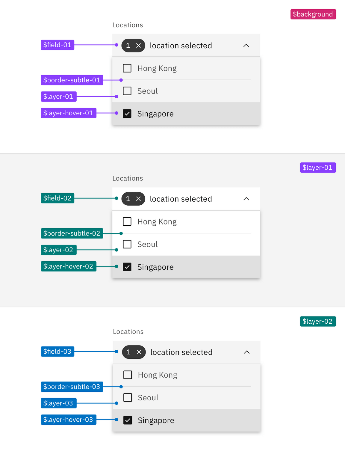
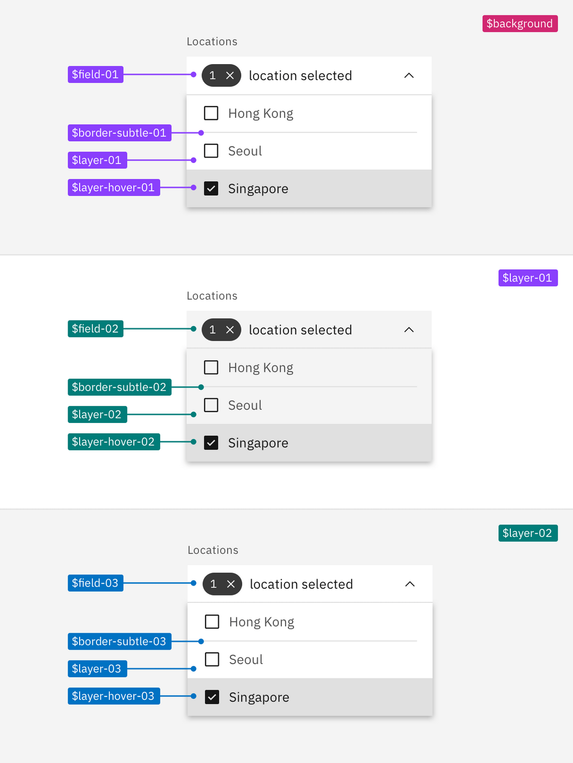
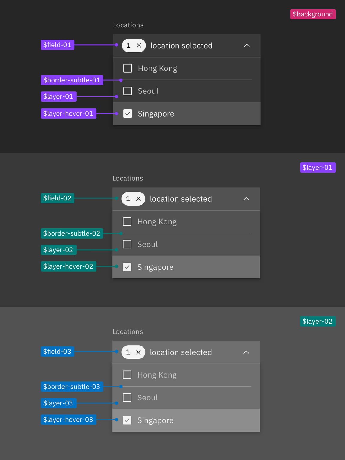
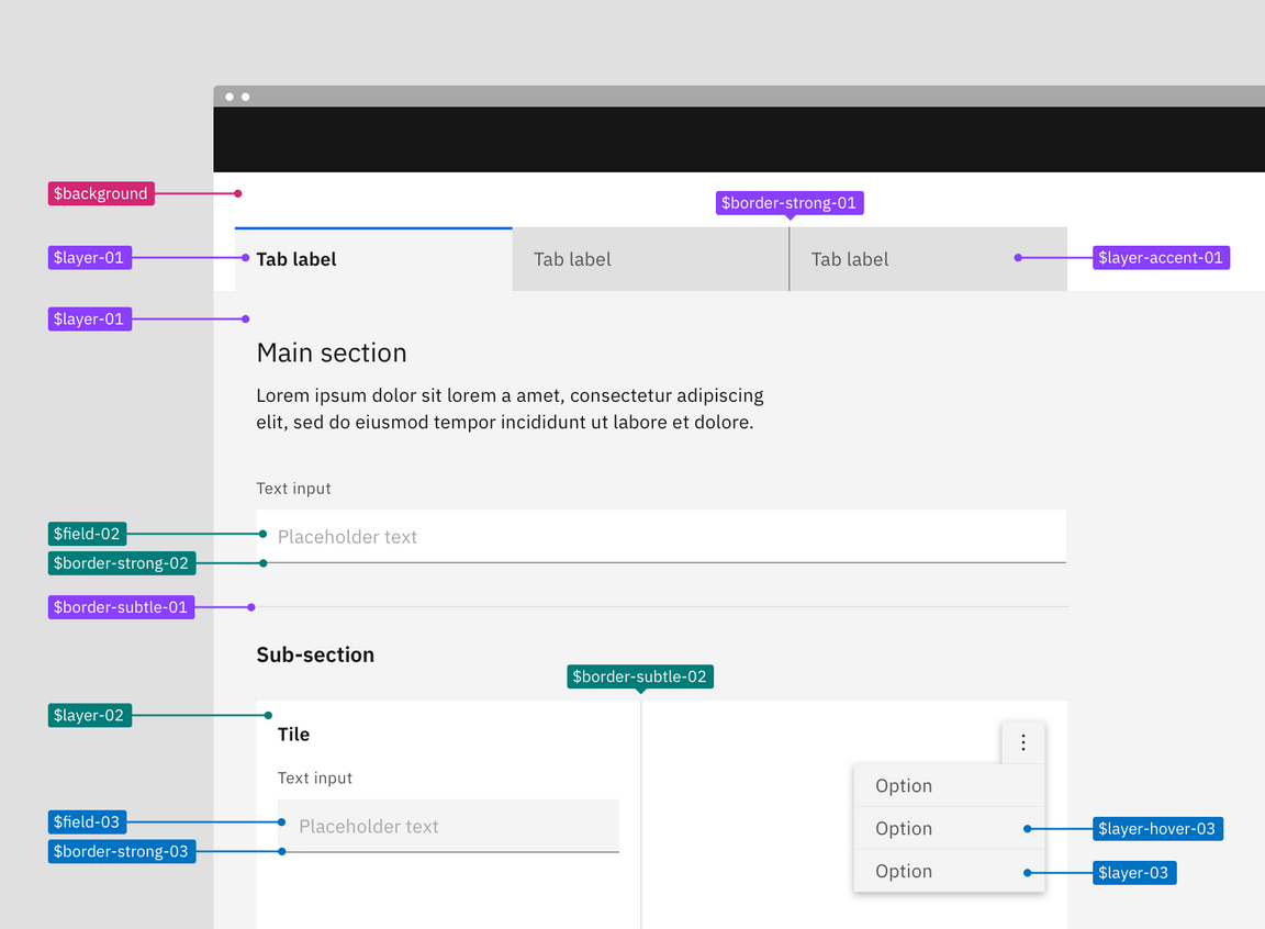
Example of how to apply layer set tokens in a layout
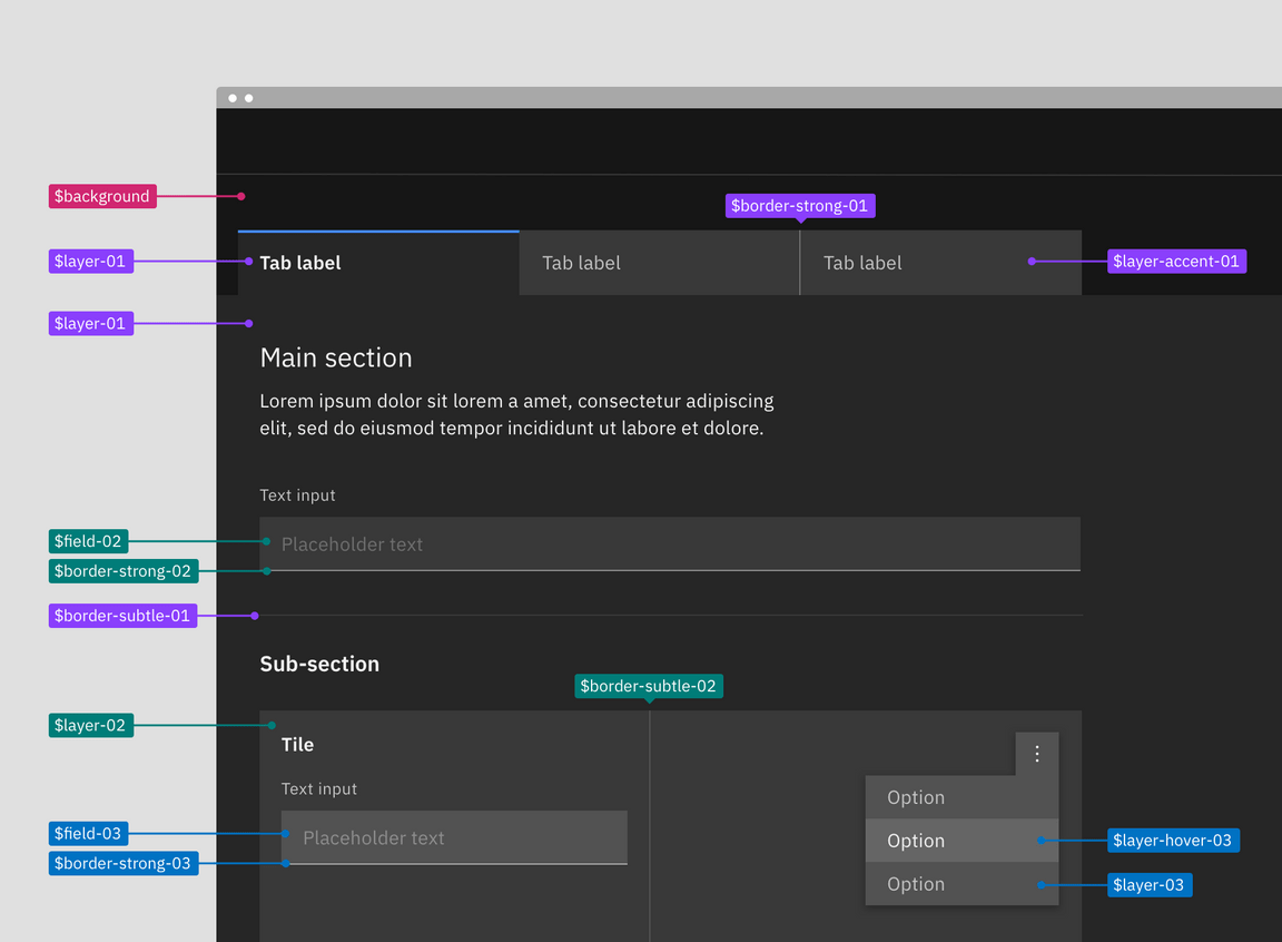
Referencing the image below, the starting base level is the page area behind and
above the tabs; it uses $background from the base set. The tab component is
layered on top of the page background to create the first layer. The selected
tab uses $layer-01 and the unselected tabs use $layer-accent-01 which is not
considered a proper layer but a supporting color for $layer inside of
components. The tab content area attached to the selected tab is also only one
layer above the base and so also uses $layer-01 as its background.
In the tabs main section, the text input field is placed on top of $layer-01
making it a part of the next layer level and will use tokens from layer set 02,
$field-02 and $border-strong-02. Also a part of the second layer level are
the tiles in the sub-section, this includes the tile background $layer-02 as
well as the border between the tiles $border-subtle-02. However, components
added on top of the tiles—the text input and overflow menu—are considered part
of third layer level and will use tokens from layer set 03.
- Base layer: Magenta
- Layer set 01: Purple
- Layer set 02: Teal
- Layer set 03: Cyan
Building components with layer tokens
Building component with layer tokens works much like how you would have built
component variants in v10. For each layer level that a component lives on, a
separate component variation must be built using the explicit layer set tokens.
In v10, these color variants were known as the light prop variants, however
these new layering tokens allows for a three levels color variant in components
that wasn’t possible in v10.
Spec each component variant with it corresponding layer set tokens. For elements that are not part of the layering model like type or icons use the normal color tokens as you would have in v10. These tokens will be the same across variants as they are high enough contrast not to need to change with each layer.
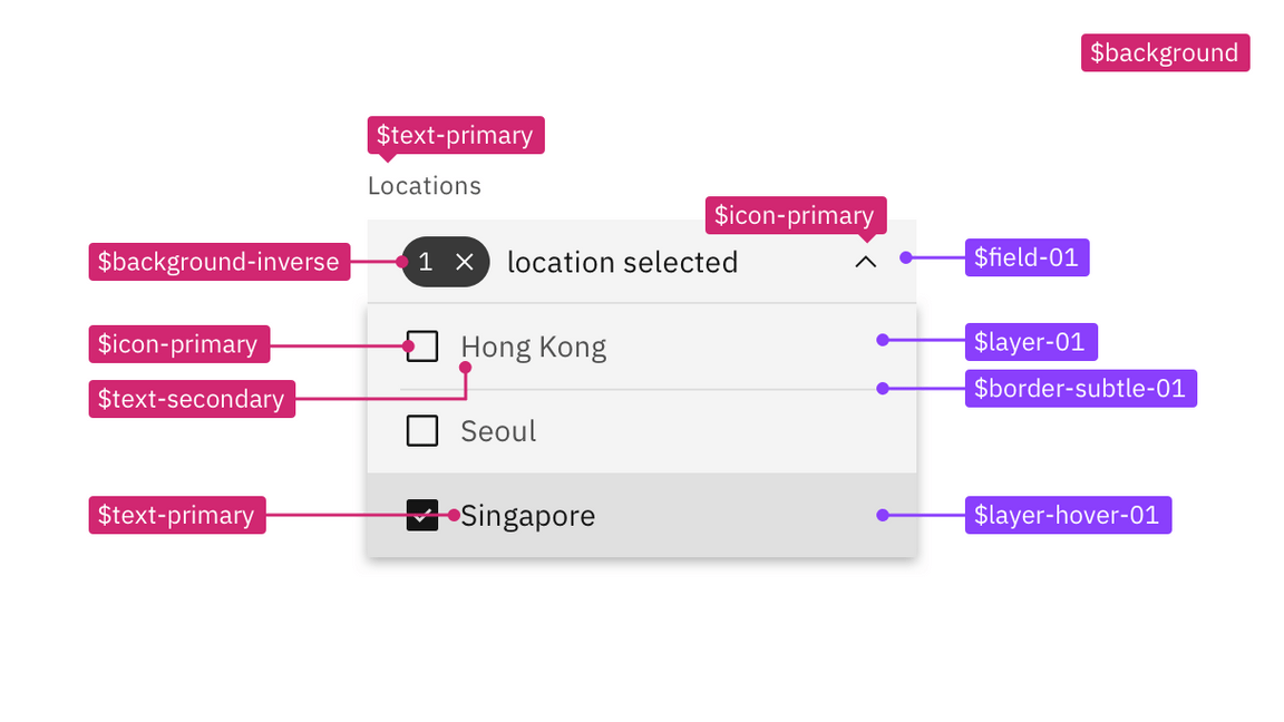
Example component spec in the white theme using the layer set 01 tokens.
Contextual layer tokens
Contextual tokens are smart tokens used to automatically map the layering model onto components in code. A contextual token is aware of what layer it is placed on and will call the correct layer set token needed for that layer level. There is only one set of contextual tokens and it requires only one variant of a component to be built. Contextual tokens are a part of the component package instead of the theme package and are used in the v11 Carbon components. To implement the nesting layers correctly in code use the layer component with the contextual tokens.
Contextual tokens have all the same type of tokens as the layer set except without the number prefixes. It doesn’t matter what layer it sits on, the contextual token is always the same across layer levels.
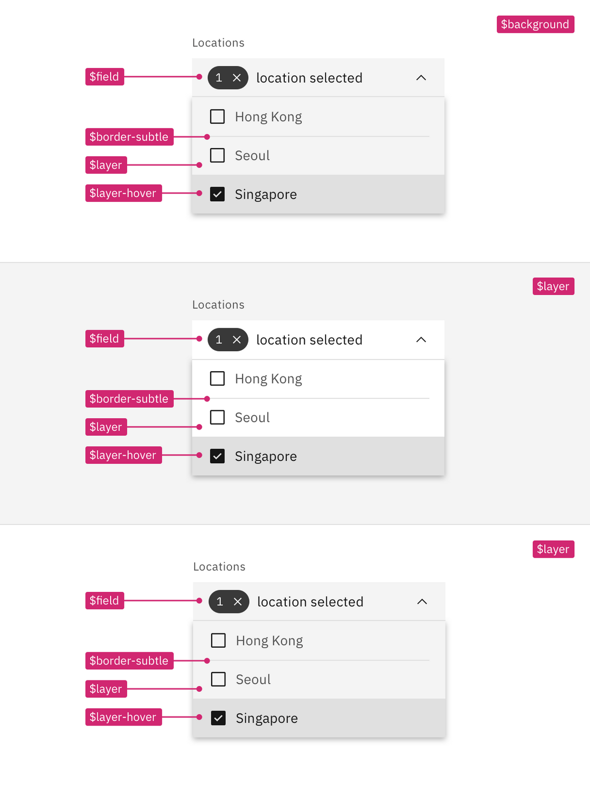
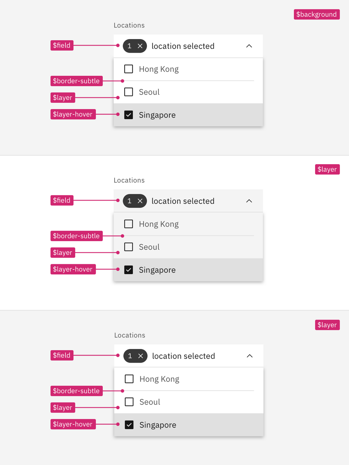
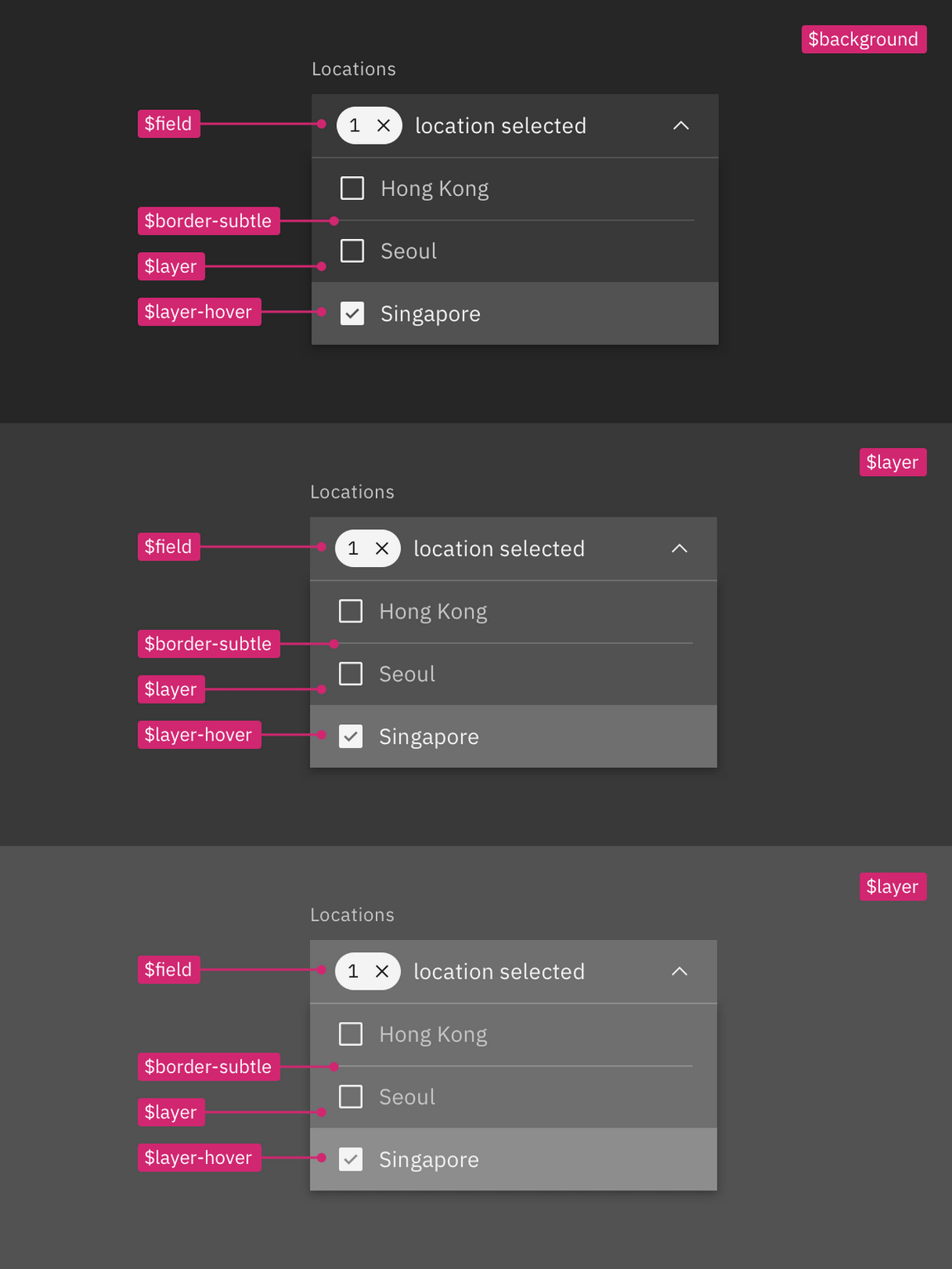
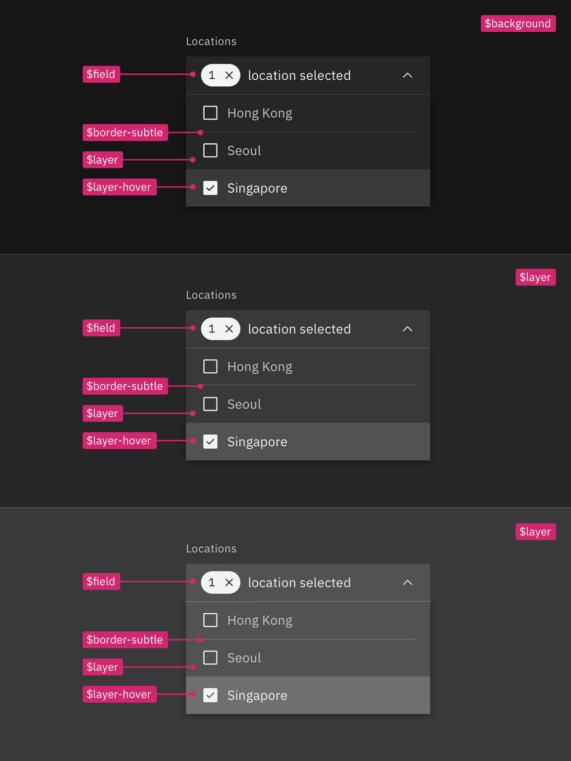
Example of how to apply contextual layers tokens in a layout
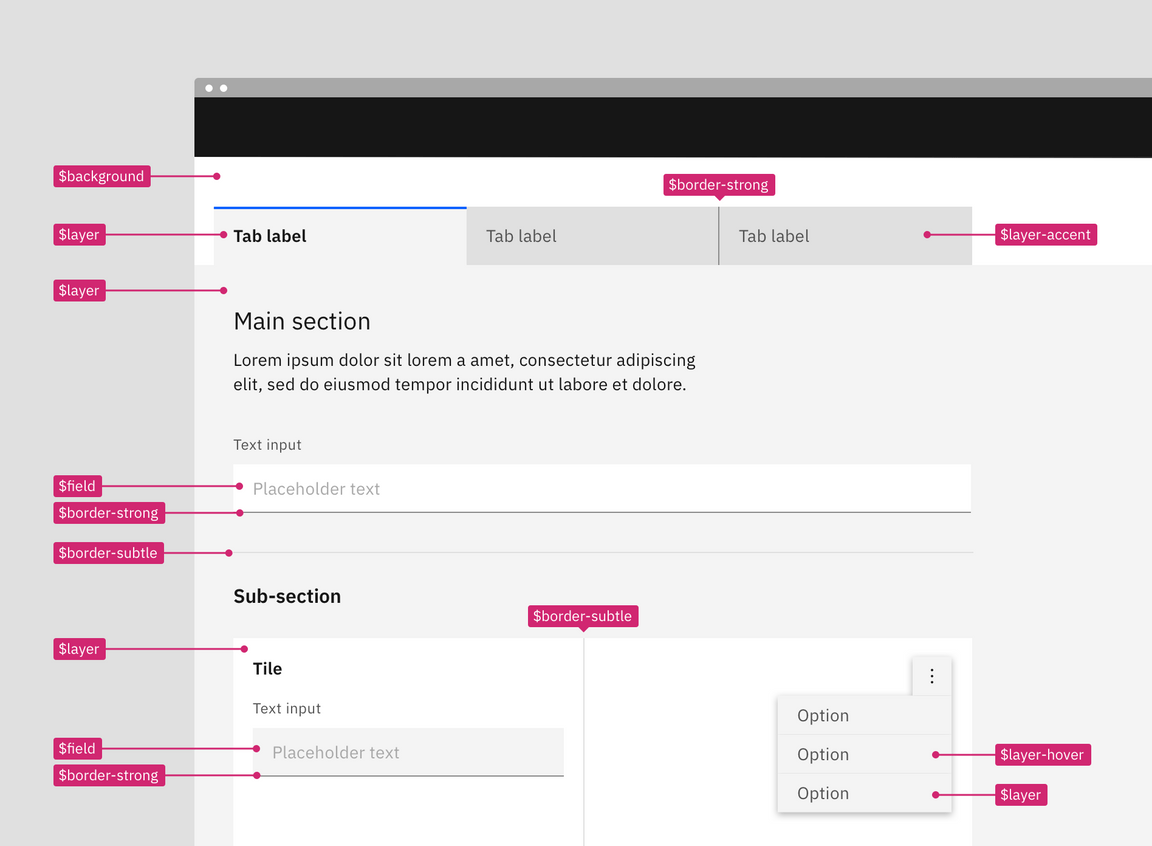
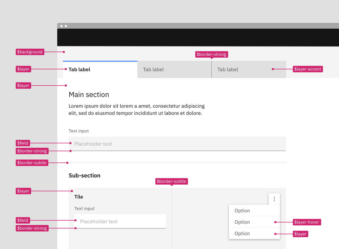
Referencing the image below, the starting base level is still the page area
behind and above the tabs; it uses $background. However, there are no sets so
with each level added simply reuse the same tokens. The tabs and the tile live
on different levels but they both use the $layer token that will output a
different values in code with the help of the layer component.
- Contextual token: magenta
Building components with contextual tokens
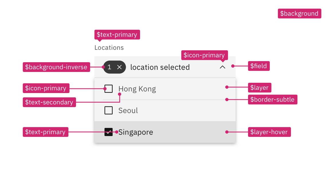
Build a single component as you would normally but apply the contextual color tokens instead of the layer set tokens. Then in your product code use the layer component to express the nested layer visuals. Even if the component is never used at other layer levels it is still acceptable and encouraged to use the contextual tokens.
Note: Contextual tokens are only available in code and are not a part of the design assets. Designer should use the layer set tokens when creating assets but can include contextual tokens in their specs and redlines.
Using the layer component
The layer component is used with the contextual tokens to implement the layering model in code. The layer component and contextual tokens are essentially a short cut for development because the layer component will apply the correct values to a single component without having to develop explicit hard coded variants.
Light or dark mode
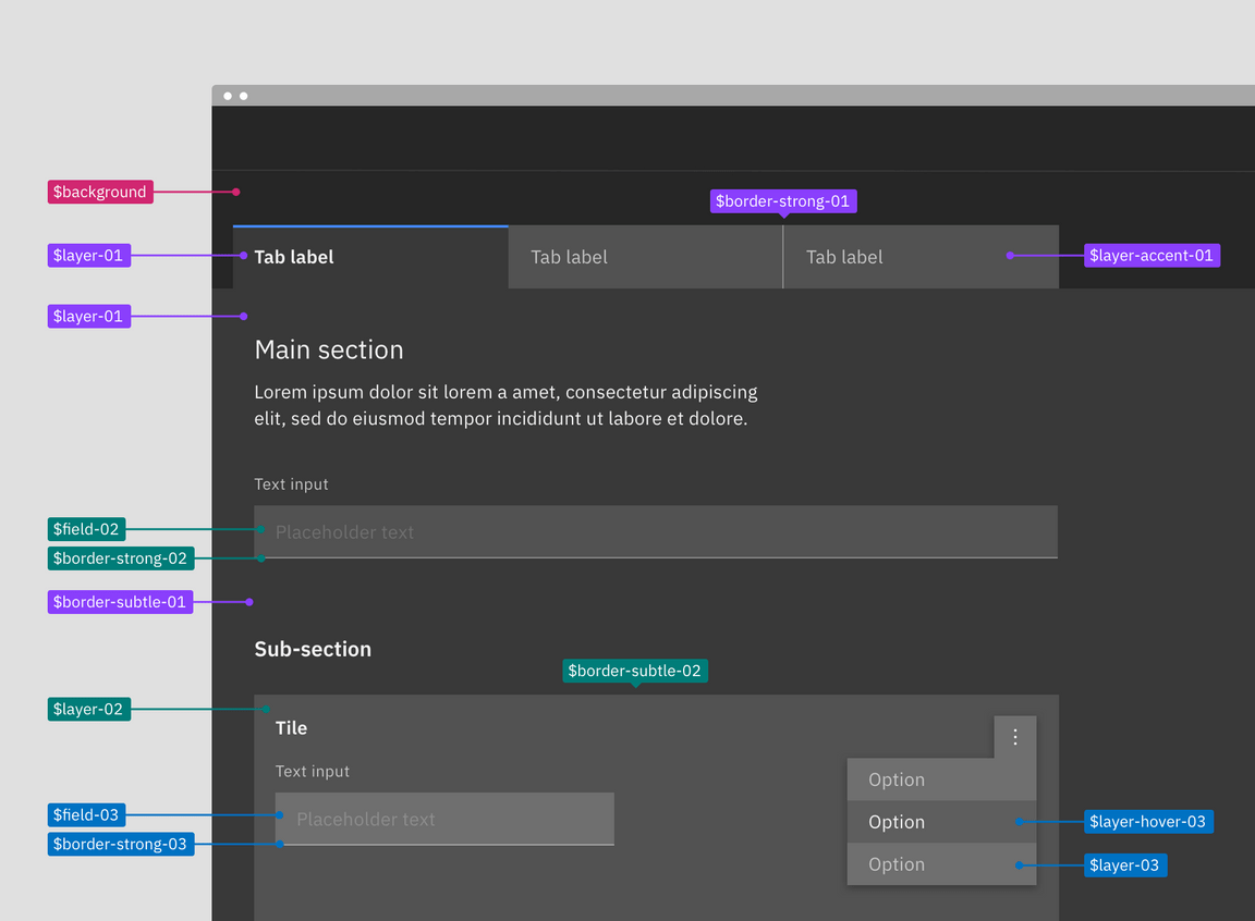
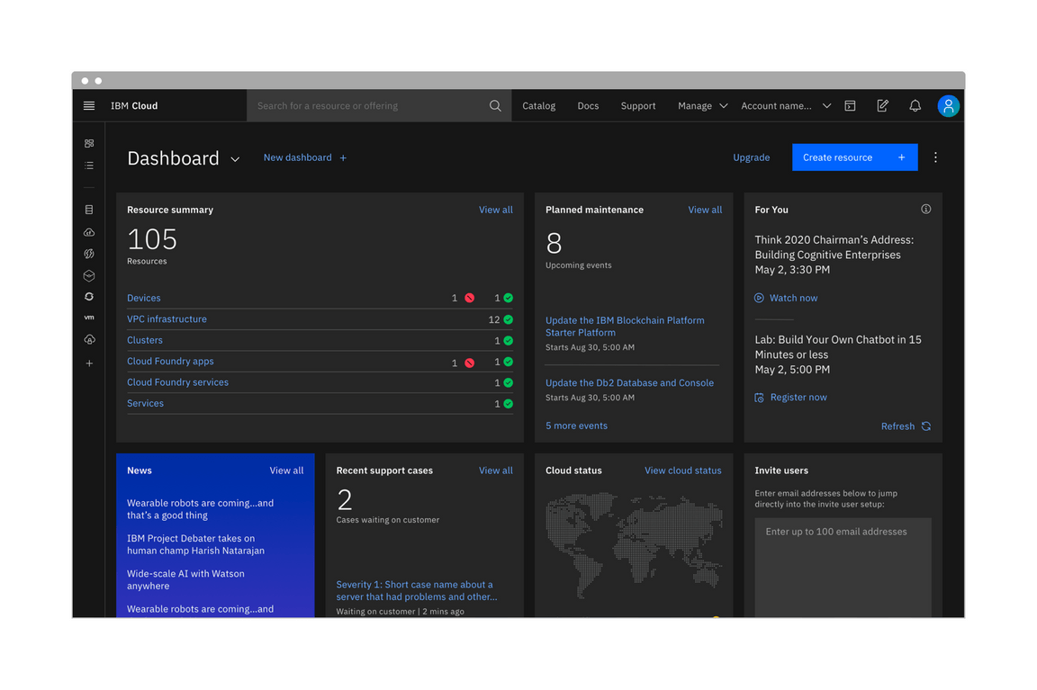
Light or dark mode is a theme setting that allows the end user to choose either an UI that is predominately light or dark in color. The UI will automatically switch from using light colors backgrounds with dark color text to using dark color backgrounds with light color text. The themes use color tokens to interpret which values are need for each theme. It is the color tokens that allows a UI to so easily switch from one mode to the next. You cannot implement light or dark mode without using color tokens everywhere in your product. Hard coded values will not change when the mode is switched.
Adding the ability to change between a light or dark mode in your product is not required as an IBM product but is highly encouraged. Most operating system nowadays (ex: MacOS, iOS, Windows, Android and Linux/GNOME 3) support dark and light modes, offering APIs so that websites and application can automatically match users preferred mode.
For users, choosing light versus dark mode is not just an aesthetic choice. While research shows that unimpaired sighted user preform better in light mode, it also shows that dark mode is better for people with cataract and related disorders. Dark mode emits less light and can therefor reduces eyes strain and help prevent headaches and migraine.
Designing for light or dark mode
You can build a light or dark mode by using the Carbon themes and color tokens. Your product will need to choose a light Carbon theme (White or Gray 10) and a dark Carbon theme (Gray 100 or Gray 90). All color in your designs and components wither Carbon, PAL or custom made should be redlined using the Carbon color tokens (it would also be to your advantage to use the color token layer styles from the Carbon design asset libraries when designing).
Redlining a design in one theme should be enough and not require duplicate designs. However, if products teams do want to have design comps in both light and dark mode then use this handy Sketch theme switcher plug-in made by an IBMer.
Creating a mode control
Since this is a user preference you’ll need to add a control somewhere in your product for the user to make a theme mode selection. This is commonly done in a display settings, user profile, or account area. At the moment, the placement and design of this control is up to product teams, further guidance and designs for a mode control in IBM products may be offered in the future.

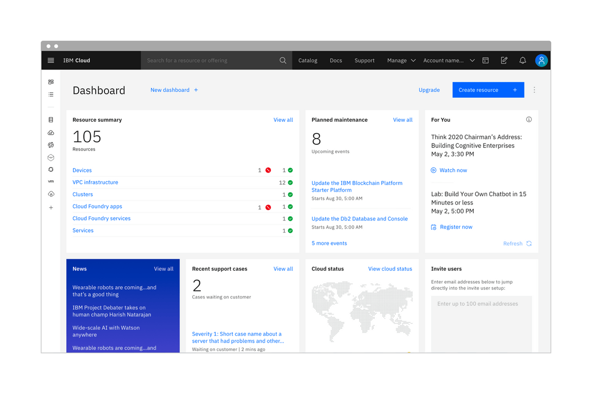
In IBM Cloud (beta), the theme control can be accessed through the user profile panel in the header (left). The "Change theme" link triggers a model where the user can save their theme preference (right).
Inline themes
Mixing themes inline is still allowed with light or dark mode. Mixing inline theme contrast between elements in different modes is also allowed. It is very common for products to have side panels or UI Shell elements be high contrast in light mode but low contrast in dark mode. These relationships can be mapped in code using the the theme component. Note that smaller components built with an inverse tokens (like tooltip) should remain high contrast when switching modes.
Consider illustrations
You’ll need to account for illustrations and other imagery like pictograms changing color between modes. Otherwise you may end up having very high contrast images in one mode vs the other. A low effort way to help design for this is to use transparent backgrounds on images and tokens with svgs files. More in depth ways to account for this would be switching out the artifacts entirely when changing modes.